NCL Home>
Application examples>
gsn_csm graphical interfaces ||
Data files for some examples

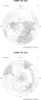
 polar_1.ncl:
The simplest. Reads in data and then creates a default plot.
polar_1.ncl:
The simplest. Reads in data and then creates a default plot.
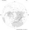
 polar_2.ncl:
Adds some intrinsic labels, manually sets the contour values, and
creates a panel plot.
polar_2.ncl:
Adds some intrinsic labels, manually sets the contour values, and
creates a panel plot.
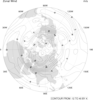
 polar_3.ncl:
Changes the neg contour lines to dash and the zero line to double
thickness.
polar_3.ncl:
Changes the neg contour lines to dash and the zero line to double
thickness.
 polar_4.ncl:Adds
shading and changes the lat/lon spacing.
polar_4.ncl:Adds
shading and changes the lat/lon spacing.
 polar_5.ncl: Demonstrates how to
block out part of the plot by creating a polygon and filling it. This
technique only works in plot coordinates, so we can not mask out the
lat/lon labels around the edge, or the edge itself when white is used
as the polyfill.
polar_5.ncl: Demonstrates how to
block out part of the plot by creating a polygon and filling it. This
technique only works in plot coordinates, so we can not mask out the
lat/lon labels around the edge, or the edge itself when white is used
as the polyfill.
 polar_6.ncl: Same concept as example
5, but in this case, we wanted to mask out the polar plot in a
semi-circle. This is more complicated b/c we don't know a priori what
the values are along the straight line. This technique draws a line
in NDC coordinates and then converts them to lat/lon coordinates.
polar_6.ncl: Same concept as example
5, but in this case, we wanted to mask out the polar plot in a
semi-circle. This is more complicated b/c we don't know a priori what
the values are along the straight line. This technique draws a line
in NDC coordinates and then converts them to lat/lon coordinates.
 polar_7.ncl: Example of a polar
vector plot.
polar_7.ncl: Example of a polar
vector plot.
 polar_8.ncl: Example of a polar
vector plot.
polar_8.ncl: Example of a polar
vector plot.
 polar_9.ncl: Example of a polar
streamline plot.
polar_9.ncl: Example of a polar
streamline plot.
 polar_10.ncl: Demonstrates how to
blow up the lat/lon labels. Unlike other plot templates, the lat/long
labels on a polar plot are not part of a tickmark object, but instead
they are text features that have been manually added to the plot.
polar_10.ncl: Demonstrates how to
blow up the lat/lon labels. Unlike other plot templates, the lat/long
labels on a polar plot are not part of a tickmark object, but instead
they are text features that have been manually added to the plot.
Note, that at present you need to load gsn*test for this feature to work.
 polar_11.ncl:
The simplest. Reads in data and then creates a default plot.
polar_11.ncl:
The simplest. Reads in data and then creates a default plot.
 polar_12.ncl:
Shows how to rotate a polar plot so that 0.0 is not facing
south.
polar_12.ncl:
Shows how to rotate a polar plot so that 0.0 is not facing
south.
 scatter_6.ncl: Demonstrates
how to draw outlined, filled markers over a polar map plot.
scatter_6.ncl: Demonstrates
how to draw outlined, filled markers over a polar map plot.
Example pages containing:
tips |
resources |
functions/procedures
NCL Graphics: Polar Stereographic Projections (high-level plot interface)
 polar_1.ncl:
The simplest. Reads in data and then creates a default plot.
polar_1.ncl:
The simplest. Reads in data and then creates a default plot.
gsnPolar = "NH"
gsn_csm_contour_map_polar is the plot interface that draws a contour plot over a polar stereographic map.
A Python version of this projection is available here.
 polar_2.ncl:
Adds some intrinsic labels, manually sets the contour values, and
creates a panel plot.
polar_2.ncl:
Adds some intrinsic labels, manually sets the contour values, and
creates a panel plot.
cnLevelSelectionMode = "ManualLevels"
cnMinLevelValF = -10.
cnMaxLevelValF = 35.
cnLevelSpacingF = 5.
Manually sets the contour levels.
tiMainString = "CCM2 T42 July"
gsnCenterString= "300 mb"
Creates a title and center string label
gsn_panel is the plot interface that creates panel plots.
gsnPanelYWhiteSpacePercent = 5, Can be used to add more white space around the individual plots in a panel. Note that this resources is applied to gsn_panel
 polar_3.ncl:
Changes the neg contour lines to dash and the zero line to double
thickness.
polar_3.ncl:
Changes the neg contour lines to dash and the zero line to double
thickness.
You must first turn off the draw and frame:
gsnDraw = False
gsnFrame = False
Draw the plot as usual, setting the resource gsnContourNegLineDashPattern.
 polar_4.ncl:Adds
shading and changes the lat/lon spacing.
polar_4.ncl:Adds
shading and changes the lat/lon spacing.
ShadeLtGtContour creates the contour map and then shades it. Note: ShadeLtGtContour has been superceded by the more versatile gsn_contour_shade. We recommend you use this instead.
mpGridLatSpacingF = 45.
mpGridLonSpacingF = 90.
changes the lat/lon spacing.
 polar_5.ncl: Demonstrates how to
block out part of the plot by creating a polygon and filling it. This
technique only works in plot coordinates, so we can not mask out the
lat/lon labels around the edge, or the edge itself when white is used
as the polyfill.
polar_5.ncl: Demonstrates how to
block out part of the plot by creating a polygon and filling it. This
technique only works in plot coordinates, so we can not mask out the
lat/lon labels around the edge, or the edge itself when white is used
as the polyfill.
gsn_add_polygon is the plot interface that draws polygons as part of a plot. This means the plots can be paneled.
gsFillColor="white", Changes the color of the polygon fill.
Note that mpMinLatF is used to set the minimum latitude shown on the plot. For Southern Hemisphere plots, mpMaxLatF can be used to set the maximum latitude shown.
 polar_6.ncl: Same concept as example
5, but in this case, we wanted to mask out the polar plot in a
semi-circle. This is more complicated b/c we don't know a priori what
the values are along the straight line. This technique draws a line
in NDC coordinates and then converts them to lat/lon coordinates.
polar_6.ncl: Same concept as example
5, but in this case, we wanted to mask out the polar plot in a
semi-circle. This is more complicated b/c we don't know a priori what
the values are along the straight line. This technique draws a line
in NDC coordinates and then converts them to lat/lon coordinates.
 polar_7.ncl: Example of a polar
vector plot.
polar_7.ncl: Example of a polar
vector plot.
gsn_csm_vector_map_polar is the plot template that creates basic polar vector plots.
vcMonoLineArrowColor = False, Turns on color vectors.
vcMinDistanceF = 0.02, Sets a minimum distance between the vectors. This is useful near the poles where the number of vectors increases. The value is in NDC coordinates.
polar_8.ncl: Example of a polar
vector plot.
gsn_csm_vector_scalar_map_polar is the plot template that draws a polar vector plot over a contour plot.
vcLineArrowColor = "white", Changes the color of the vectors.
vcGlyphStyle = "CurlyVector", turns on curly vectors.
gsnScalarContour = True, Draws the contour plot under the vectors rather than have the vectors be colored by the contour plot.
 polar_9.ncl: Example of a polar
streamline plot.
polar_9.ncl: Example of a polar
streamline plot.
gsn_csm_streamline_map_polar is
the plot template that draws a polar streamline plot.
stArrowLengthF = 0.008,
controls the length of the directional arrows. The default is
dynamic.
stLengthCheckCount = 15,
controls how frequently a new streamline is started. The value is
in terms of an internal NCL loop that calculates new starts. The
default is 35.
stArrowStride = 1,
Controls in which grid cells an arrow head is draw. The default
is every other grid cell.
stLineStartStride = 1,
Controls which grid points are allowed to start new
streamlines. The default is 2, which is every other grid
cell.
stMinArrowSpacingF =
0.035, controls the distance between drawn arrows. The default is
0.0, which could draw arrows right on top of each other.
stStepSizeF= 0.001,
Controls the basic step size used to create the streamline. The
default is dynamic.
The following two resources on the ones that you will really have to tweak depending upon the field you are plotting.
stMinDistanceF = 0.03
stMinLineSpacingF =
0.007,Controls the minimum distance between drawn
streamlines. The default is dynamic.
 polar_10.ncl: Demonstrates how to
blow up the lat/lon labels. Unlike other plot templates, the lat/long
labels on a polar plot are not part of a tickmark object, but instead
they are text features that have been manually added to the plot.
polar_10.ncl: Demonstrates how to
blow up the lat/lon labels. Unlike other plot templates, the lat/long
labels on a polar plot are not part of a tickmark object, but instead
they are text features that have been manually added to the plot.Note, that at present you need to load gsn*test for this feature to work.
gsnPolarLabelFontHeightF= .025, will change the font height of the lat/long labels w/o changing the gsn* string text.
gsnPolarLabelDistance = 1.08, Controls how far away from the circle the polar labels will be drawn. These labels are not a tick mark object. They are are text that has been manually added. A determination was made as to how far away from the edge to place this text. When the ability to blow the text up was added, it ran the 0 and 180 text into the circle. Note that this resource moves all the text out, and not just the 0 and 180.
 polar_11.ncl:
The simplest. Reads in data and then creates a default plot.
polar_11.ncl:
The simplest. Reads in data and then creates a default plot.
gsnPolarLabelSpacing = 90, controls how frequently to label the lat,lon lines. This is different from a tick mark resource b/c polar tickmark labels are actually added text.
 polar_12.ncl:
Shows how to rotate a polar plot so that 0.0 is not facing
south.
polar_12.ncl:
Shows how to rotate a polar plot so that 0.0 is not facing
south.
mpCenterLonF controls what longitude is at the center of the plot. This resource can be used adjust what longitude is facing south.
 scatter_6.ncl: Demonstrates
how to draw outlined, filled markers over a polar map plot.
scatter_6.ncl: Demonstrates
how to draw outlined, filled markers over a polar map plot.
The gsn_add_polymarker function is called twice for each range of values: once to draw a filled dot (gsMarkerIndex=16) and one to draw an outlined dot (gsMarkerIndex=4). This gives the appearance of outlined markers. The marker sizes (gsMarkerSizeF) range in value from 0.025 to 0.075.
The random_uniform function is used to generate random data.